
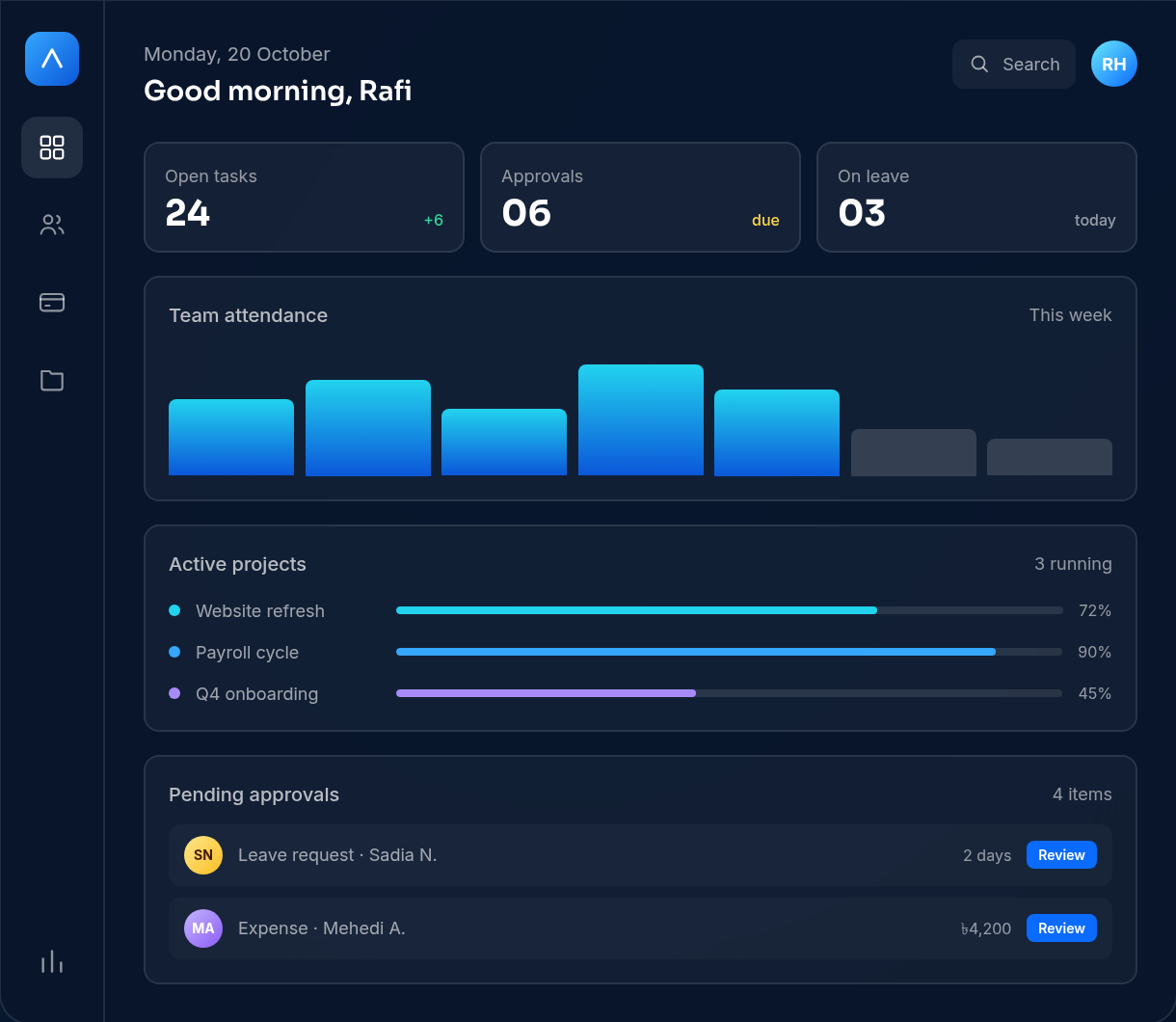
When an operations product starts to feel heavy, the instinct is to redesign the interface. New navigation, a cleaner dashboard, fewer clicks. It rarely fixes the feeling, because the friction is usually not on the screen. It is in the data model underneath it.
Start with the record, not the screen
We spent the first weeks of TaskShaper not drawing screens but asking a less exciting question: what does this system treat as one fact?
A person is one fact. Their leave balance, attendance, payroll line and project allocation are views of that fact, not separate records to be reconciled. Once we wrote that down, a lot of interface decisions made themselves. There was no longer a question of where to edit a phone number, because there was only one place it could live.
Most operations software drifts because each module owns its own copy of the truth. HR knows one start date, payroll knows another, and the project board quietly knows a third. Every export is an apology for a decision nobody made early enough.
“If two screens can disagree about the same person, the product is already lying to someone.”
Find every handoff
We mapped the work the way an operator experiences it: hire to payroll, leave request to project plan, quote to invoice. Along that path, we marked every handoff — the moment where a human copies information from one place to another. Each mark was a candidate for either automation or deletion.
- Copying data is a bug. If a person is re-entering information that already exists, the system should do it.
- Approvals need a home. A request in a chat thread has no status, no owner and no history.
- Reports should not be exports. If the weekly view requires a spreadsheet, the product is missing a screen.
- Edge cases deserve design. A mid-month raise, a missed punch, a cancelled project — these are the moments that decide whether a team trusts the tool.
The goal was not to remove every step. Some steps exist for good reasons: a payment should be approved, a leave request should be seen. The goal was to remove the steps that only existed because two systems could not talk to each other.
Permissions are part of the workflow
Role-based access is often treated as a settings screen bolted on at the end. In an operations product, permissions are the workflow. Who can approve a salary change? Who can see a colleague's contract? Who can close a project that still has unbilled hours?
We modelled permissions alongside the record, so an approval route is not a generic “manager” flag but a specific, auditable path. That choice made the UI simpler, because the product could stop offering actions a person was never allowed to take.
Ask an operator to find one fact — a start date, an approval, an invoice status — and time how many screens it takes. If the answer is more than one, the record is not really connected yet.
What changed after launch
The first release was deliberately narrower than the eventual product. People, leave, attendance and payroll shipped first, because that loop carried the heaviest duplication. Projects and invoicing followed once the core record proved stable under daily use.
That sequencing mattered. Had we built every module at once, we would have designed each one against a guess about the others. Building the record first meant later modules inherited a truth that had already survived real use.
The interface did get cleaner, eventually. But the change people noticed was not visual. It was that the same information stopped appearing twice, and the week stopped being a sequence of reconciliations.