
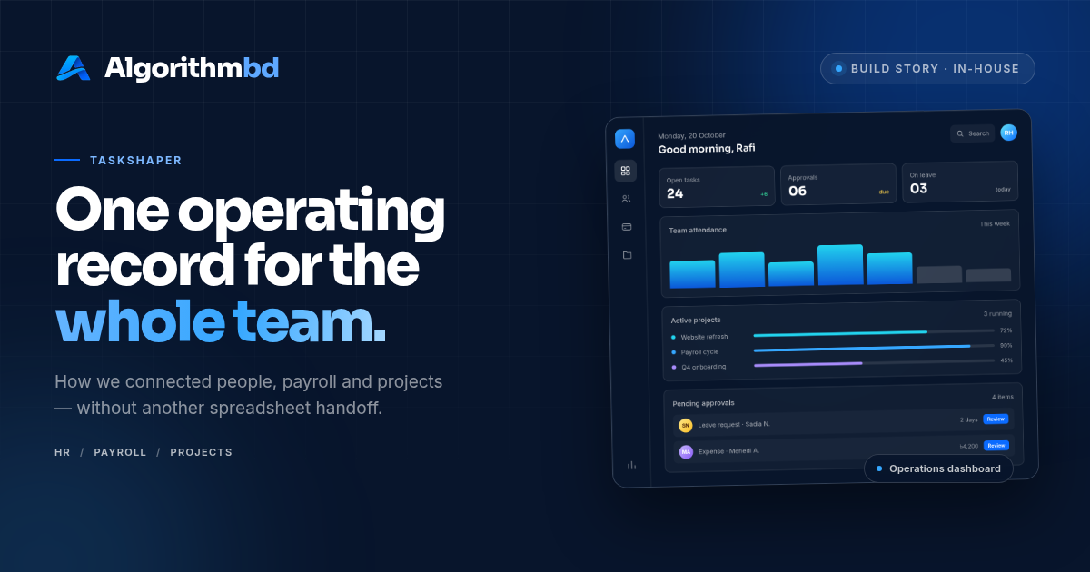
Every operations product has an approval flow. Most of them are designed as settings: who can approve what, how many levels, which conditions trigger an escalation. The settings are usually fine. The moment someone has to act on them is where approvals fail.
Design the moment, not the settings
We start with the person who receives a request. What do they see, what do they already know, and what is the smallest decision they have to make? If an approval screen requires opening three other pages to understand the request, the flow is broken no matter how tidy the configuration is.
The strongest pattern we have found is a single request view that contains the context, the consequence and the action. Approve, decline, or ask a question — with enough information to choose honestly.
“An approval is a decision, not a notification. The screen should make the decision easier.”
Every request needs one owner
A request with no owner is a request that waits. Named ownership is not bureaucracy; it is the difference between a queue and a workflow. We make the current owner visible at every point, including when the request is waiting on the requester.
- One current owner at any time, with a clear handoff when it changes.
- A reason attached to every decline, so the requester can act instead of guessing.
- An escalation path that is visible before the deadline, not after it.
- A timeline that shows what happened, who did it and when.
Defaults do the heavy lifting
Most approvals are routine. The system should know that. Sensible defaults — the right approver, the usual route, the expected amount — let people act quickly on the normal case and pay attention to the exceptions.
We reserve friction for the decisions that deserve it: a payment above a threshold, a change that affects someone's contract, a request outside policy. Everywhere else, fewer steps means fewer abandoned requests.
If requesters abandon forms halfway through, the form is asking for information they do not have. That is a design problem, not a user problem.
Make the history visible
An approval is also a record. When someone asks why a payment went out or why a leave request was denied, the answer should already exist. We treat the audit trail as part of the interface, not a database detail that only engineers can read.
Visible history changes behaviour. People write better reasons when they know the reason will be seen, and teams stop relitigating decisions that are already documented.
The result is unglamorous: fewer messages, shorter waits, and a flow that quietly works. That is the standard we aim for.